

“Ignoring online marketing is like opening a business but not telling anyone.”
In spring 2020, when the whole world is quarantined, the business community suffers from a drop in offline sales. Well, at least those who haven’t switched into the online format and improved their position among internet users. For you, the period of self-isolation is the right time to open a new chapter and boost your business with the newest tools.

Why?
Because the number of potential customers, locked at home, is rising every day, and the rivals are already making money on it.
How?
The first step for online sales is a competitive website, understandable, and comfortable for clients. At the very first glance, it shows the quality of your products and service, sets the positioning, and establishes the communication. The right site motivates the user to come back and work with you.
To help you with moving in times, we’ve gathered the hottest tendencies in site usability. See the examples of really bad websites and the role models of today’s internet marketing.
Step-by-Step Usability Analysis
#1 Loading Speed
We live in the epoch of fast information, and no one will wait until your website finally runs. The slow website leads to losses. Provide the fast download either on the desktop and mobile devices with a high-quality hosting. In case you cannot afford it right now, give up the elements that slow the loading down.
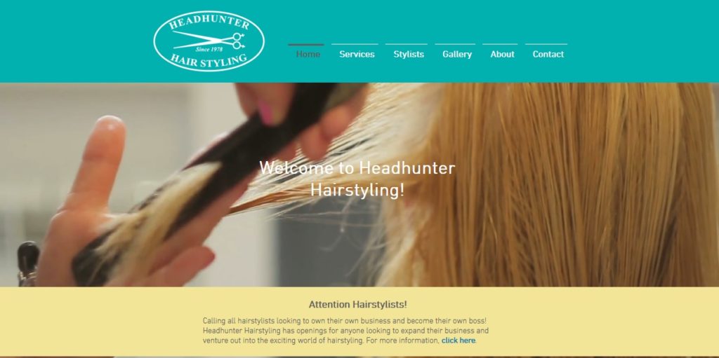
Look at this hairstyling service – the interface is stylish, but large photos and the HD videos at the guest page make it extremely slow.
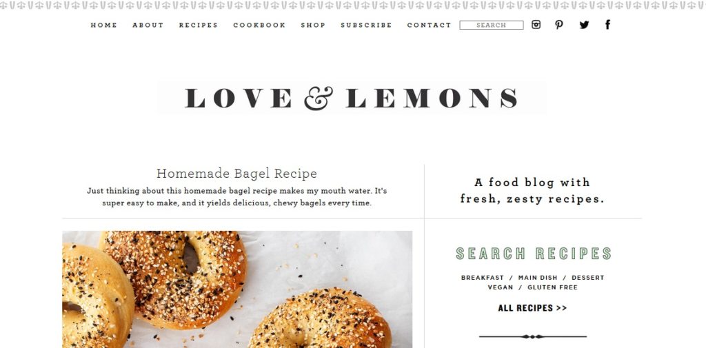
Giving up such parts is not a big deal, however. You can easily create a classy and memorable page with the bare minimum components. This Love&Lemns cooking website surely does not spend a lot on hosting – in return, it is very quick and dynamic.
#2 Design
Catchy, simple, and welcoming – these are your priorities. To choose the style, think of the theme. Online banks prefer solid blue or yellow colors, beauty parlors – rose and peachy, eco shops – green and brown. Think of fonts, photos, and videos, fields with forms and icons. Connect all elements with shades and graphics.
Unlike technical characteristics, websites with the good and bad design are well recognized among all users. That is why you should take the matter seriously.
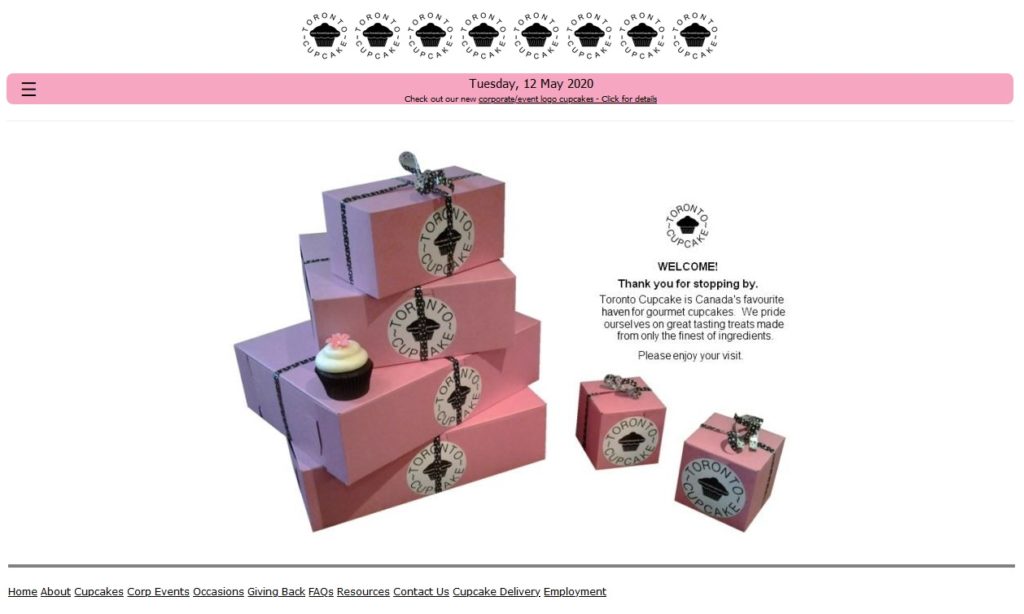
See what can happen if you forget about the style. Unmatching fonts, primitive colors, and dark pictures won’t make Toronto cupcakes appetizing.
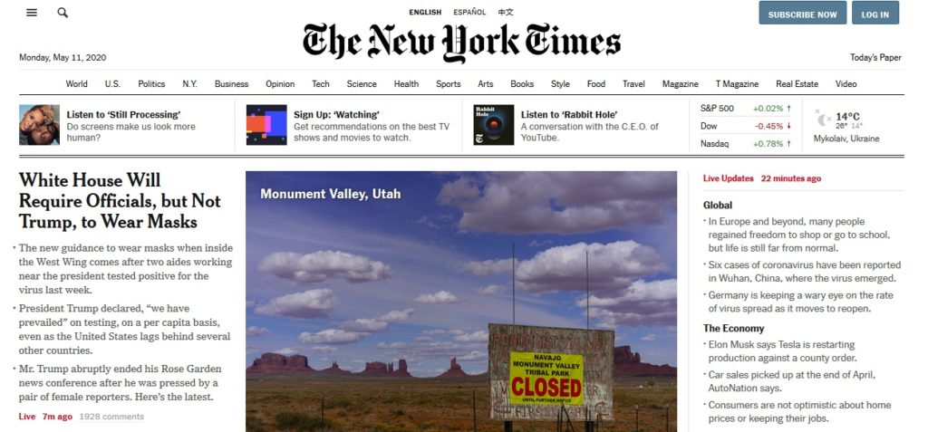
On the contrary, a good design sets the atmosphere and differs from the others. You may not read the New York Times, but you certainly remember their logo and the feed, stylized as a classic newspaper.
#3 Intuitive interface
Bad user experience puts an end to the new deal. Do not let your customers look for the required information and services longer than a minute by following the common models and templates.
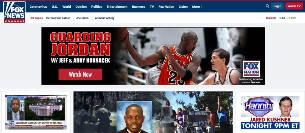
Fox News seems a qualitative news portal, but the website, cluttered with unnecessary photos and sections, mix you up. Such an interface is especially inappropriate for news, that must be well-structured.
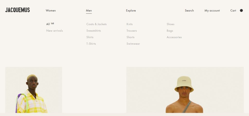
Jacquemus’ online shop is all about comfort. The expected position of buttons and options make them easy-to-find. The less is always more – a large distance between text and only essential information makes the page clear and convenient.
#4 Navigation
The information flow rushes at a crazy pace. Your customer won’t spend the time on bad navigation. Adapt the website for the need of time, making it dynamic.
Add more clickable buttons so as users can surf the website no matter where they are. Provide a good search system and make all links notable and easy to click.
Avoid impasse pages. The last page of the catalog has to redirect the client to the first one or offer another section.
Dead-end pages are not a death sentence. Do not allow them to be empty: explain, what happened and why the customer is here, and suggest visiting some sectors.
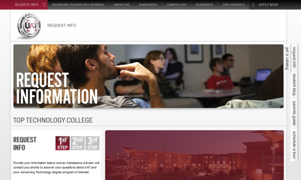
In addition to the awfully long loading, The University of Advancing Technology gives us an excessive amount of unordered links and banners. You cannot predict where to find certain options – almost every page suggests you fill in the forms and do not give the expected info.
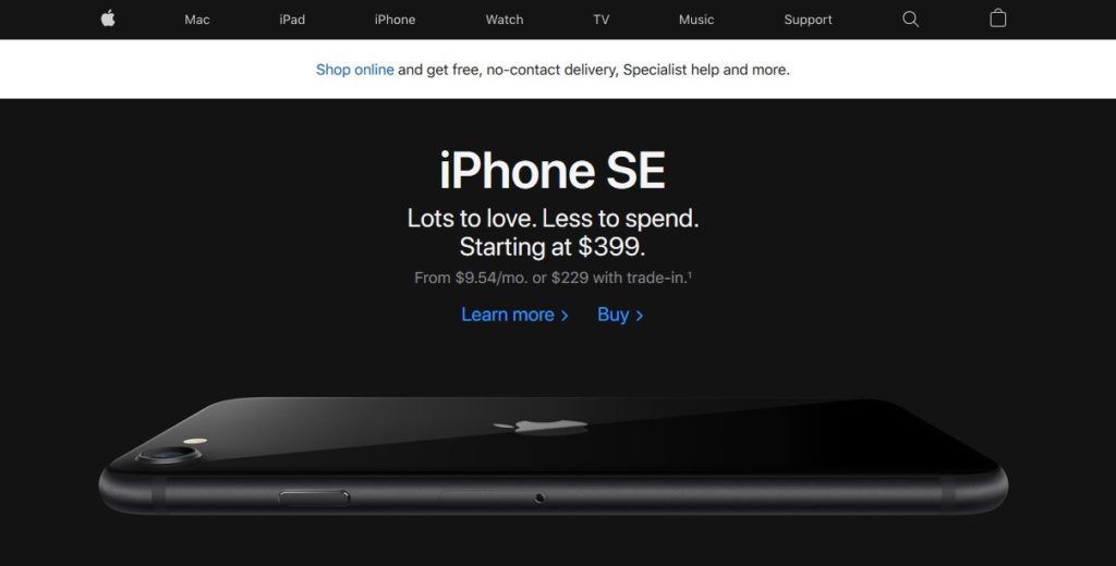
Apple was one of the first to recognize the importance of usability. You can find the essential section on the very top of the page, the search system is clear and fast, and the banners combine catchy pictures with the discreet position and style.
#5 Home Page
You won’t have a chance to make a first impression twice. Snow your uniqueness and put the main offer on the very first page the user will see.
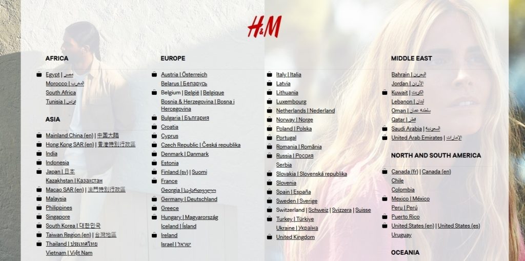
H&M official website offers us to choose the country on the home page. Not so bad, but bad looking interface, the small size of the SEO text, and the lack of typing box really annoy and make you waste the time.
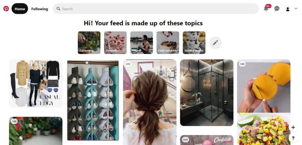
Pinterest shows its main function from the very first page, showing you a feed full of trendy ideas and stylish photos. It certainly makes you want to sign in as fast as possible and start watching.
#6 Photos and Videos
An obvious tip, but many entrepreneurs neglect it, getting in trouble.
At first, use only high-quality bright pics to make them good-looking either on phones and on huge desktop monitors. In 2020 more and more people judge the company by its visual content, bot by the texts – they simply haven’t time to read a lot. You may give a piece of useful information and offer good services or products, but bad designed websites always lose. The best choice according to today’s trends in your own photos – you can make them with the help of a smartphone and simple editing programs. The priority is sincerity and personal brand.
Another moment is copyright. Use your own photos or by them at the photobanks. The world is small and searching engines are improving their algorithm faster than you think – stolen content will not go unnoticed.
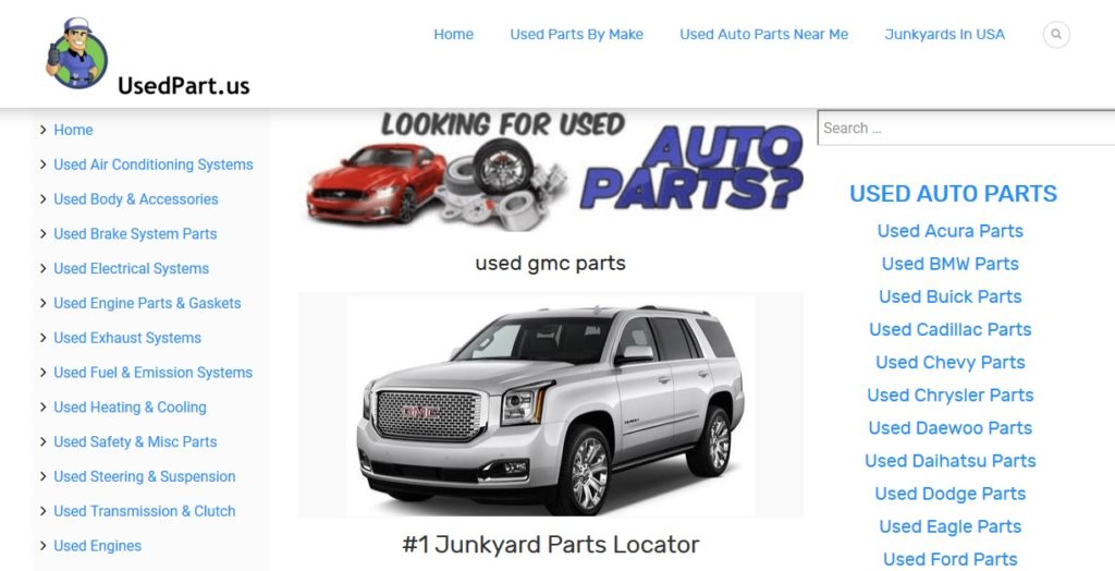
The website, selling auto parts in Ohio looks cheap and unreliable because of the poor quality photo, taken from the photobank.
Personal photos are specifically useful if you sell services and your website needs an author – this way people will trust you. This blog about fitness familiarizes you with the author and build seller-buyer relations.

#7 Contact Information
Not every user wants to make the order online – or, the website may not be suited for it. Let the customer easily contact you, ask any questions. Private talk is a good way to build a trusting relationship and persuade the client to use your services.
Put the contact section on every page either in the heading and footer. Better use text format to make the information available for copying. In the mobile version provide the button for the call. If you can’t receive calls 24/7, provide a chat-bot, or suggest to recall in a certain time.
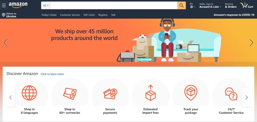
The world-famous Amazon shop is very well optimized for users, but contacts are a week point. You see no opportunity to keep in touch with support and get any personal attention.
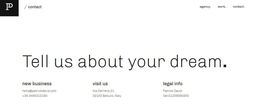
PatrickDavid agency is an excellent example of communication with the client. The offer to motivate you is “Tell us about your dream”. After that, you can click on the contact info.
The period, when the website was a special privilege for famous companies, has passed. With the help of online builders and affordable services, you can assert yourself on the Internet and set the matching image. Nowadays a good website is an essential part of every business – you cannot even imagine, how much income you lose because of a bad site or its absence. Boost your skills and outline the strategy for development, analyzing the cases on the Internet, and adapting to the needs of your customers. Remember that the function of a web page is to draw the attention, show your offer, and make the customer use it in any possible way.
Using the newest instrument, you can effortlessly create a convenient space for your business.